Campsite Rules for Sketch

Campsite Rules for Sketch


Campsite Rules for Sketch

This article will cover steps and tips to help prepare, organize and maintain your Sketch files to ensure that anyone inheriting your work won't curse your name in their sleep.

Campsite rule: I'm borrowing this one from the dating advice podcaster and columnist Dan Savage who defines it as the obligation one has to leave their romantic partner in "better shape than they found them." He's especially concerned with relationships where there is a large age gap and addressing the older individual's responsibilities to the younger.

For our purposes: The Sketch file (.sketch) is the young and at risk individual, the designer (you) is the older individual and the next designer (your coworker, boss, etc.) is the next relationship the Sketch file will find itself in. So to complete the metaphor, it's your job to ensure that the next person who uses this file isn't picking up it's broken pieces and spending hours of time attempting to repair it. So let's get to it.

Where to begin?

Let's start with a new file. Pristine, blank and unadulterated. It could go any direction from here, so let's make sure it grows into something beautiful, organized and easy to work with.


1. Use the Right Artboards: This one is pretty obvious, but know what you're building for and use pre-existing artboards whenever possible.


2. Name Things Appropriately: If you're creating a flow, make sure that each artboard is named logically. Don't leave a page with multiple artboards/screens that have "copy" in their title.

Naming.png


3. Create Text Styles: This is perhaps most important; when you create text, size it and assign it a font, make sure to create a Text Style at the same time. These make updates within the entire file a breeze instead of a nightmare.


4. Create Groups, Name them and Organize them: It's really helpful for your workflow and organization to group elements together. Shift+Click is your best friend when selectively choosing items to group.


5. Create Symbols: Like text styles, symbols also allow for easy updates across your file. Edit the content when needed and detach when necessary, but make sure to rename them when you do.


6. Arrange Layers in Logical Orders: Headers should go on top in the list. Less obviously, footers should go above content, and content below footers. Backgrounds should be on the very bottom and locked to prevent accidental movement.

Arranged Layers.png


7. Organize/Remove Clutter: As you work, clean up after yourself. Maybe you dragged in some images you're not using or have some copies of artboards lying around. You can create a new page for them if you don't want to delete them but clean up your main pages.


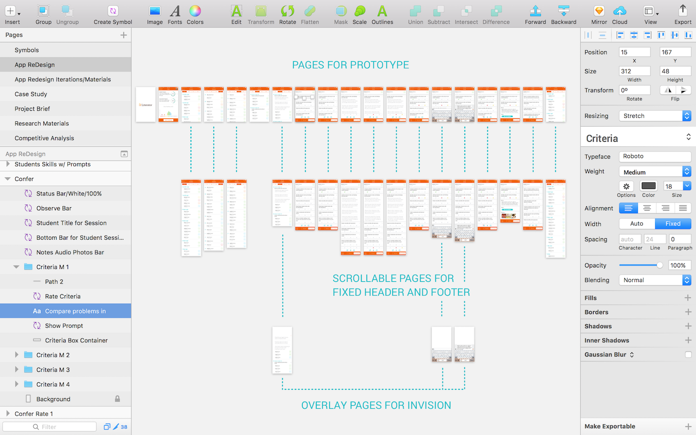
Example of a friendly sketch file:

In the image above you can see that this page is well organized and though it's not perfect, it is consistent and easy to navigate. Your way of doing things doesn't have to match this, just make sure it's sensible and systematic.


Use these plugins to increase efficiency and avoid catastrophe:

Google Drive: To avoid losing hours or even months of work, download Google Drive and save your files there. You get 15GB for free and it syncs automatically, allowing you to sleep stress free.

Spell Check Whole Page: Still a missing feature in Sketch, this plugin will spell check every layer on the page you're currently on. *Disclaimer: As of now, this plugin lacks the ability to check symbol overrides, so be aware of this issue when using.

Zeplin: This is great for when your designs are done and ready to turn over to developers. You select what you want to export and Zeplin generates style guides and specs that are pixel perfect. It does a lot more as well, so be sure to check it out.

Craft: This crazy suite of plugins allows you to do a whole lot of cool stuff. Kind of an honorable mention more than anything else, definitely worth checking out!


And with all these considerations in place, your campsite should be nice and inviting for future guests!

Am I missing something? A fundamental of designing in Sketch? Maybe a tip, essential plugin, or link to a great resource/article? If so, please let me know! I'm always happy to make this resource more complete. Thank you for reading and sharing!

Additional Learning/Resources:

10 Tips and Best Practices for SketchApp

5 Things to do Before Starting your Next Design File in Sketch

5 Tips to Help you Design Faster in Sketch

How to Make a Layout Grid in Sketch

Sketch Shortcuts


Ergonomic Design

Ergonomic Design


THUMB LIMITATIONS

Some apps force users to perform painful movements to reach a command without the use of their second hand. This is a design oversight for mobile apps in particular as well as responsive websites. The lack of ergonomically conscious user interfaces can lead to problems for both the user and the product's usability.

A history of one handed accessibility for the right hand thumb.

The graphics above are a great guide for where CTAs and repetitive interactions should take place on a phone. The green represents the area that falls within the range of comfort for the thumb. The orange areas are harder to reach but still accessible without significant discomfort. The red zones either hurt to access or are completely out of the thumb's range while holding it with one hand.


When the layout of an app's design causes undue stress in the hand to accomplish a common task, this can have huge effects on continued use of the product. If a user can't reach it, they may find the interaction laborious, potentially disrupting desired user flows and negatively effecting conversion rates. If a user feels pain in their hand from using an app, they might even feel motivated to leave a negative review in the App Store, further effecting growth of the product user base.

Distribution of the three most common holding positions.

The use of the app/website should be considered. For games, two handed use is often expected, but for something like a transportation app one hand may be more common. So when designing there are some questions that should be asked:

  • Is the user likely to have both hands free? If not, then ensuring that both the primary and secondary CTAs are within reach of the thumb is probably a good idea.
  • What if a mistake was made? Is the cancel/back option in the hard to reach top corner?


Apple was clearly aware of this issue when they introduced their larger screens with iPhone 6, but the lack of user adoption with Reachability is evidence that Apple failed at addressing this problem for most users.


VISUAL CONSIDERATIONS

Eyes develop their own habits that are tied to comfort. After long periods of time we develop mental models based off experiences interacting with many products. Our cultural and educational upbringings have also trained our brains in certain ways, such as looking and reading from left to right, top to bottom.


At this point in 2017, most of us expect the "Next" or "Submit" CTA to be a thick bar located along the bottom of the screen. Experimenting with placements of interactions that have become universal can create discomfort and annoyance for the user, resulting in reduced user satisfaction.

Eye tracking display of where users tend to look on their devices varying from smartphones to tablets.

Knowing these things about human expectations and habits can help us plan for where to put the main content on a page. This can also be applied to modules, pop ups or other things we really want the user's attention to focus on.


A particularly frustrating structure commonly in use is websites with a thick banner that remains at the top of the screen as the user scrolls down, constantly forcing their eyes to look towards the bottom two thirds of the screen where the content is. This goes against our natural inclination to keep our focus in the center to top region. 


EYE-THUMB COORDINATION

Control of motor functions, hand dexterity and clarity of vision vary from person to person and are all factors that contribute to a user's ability to interact with a product as intended. Ensuring that interactions have enough space between themselves so that precision isn't required by the user is a great way to prevent user frustrations.

This diagram shows user accuracy in relation to screen placement.

The diagram above displays circles that's represent the varying accuracy users have in a particular area of the screen. The smaller the circle, the more accurate users tend to be. Users tend to be more precise in the center of the screen because the thumb is more relaxed. The larger circles in the corners reflect the difficulty in reaching these places--we must strain to reach these places and so our accuracy suffers as well. On top of that our vision is impeded by our own hands at times, also adding to our inaccuracy.


ALL TOGETHER NOW

Incorporating ergonomic principals into our designs is something we should always keep in mind. Comfort increases usability, decreases friction and allows us to enjoy the product experience more, increasing our likeliness to want to use the product again in the future.


Resources/more information:

How to Design for Thumbs in the Era of Huge Screens

Mobile Touch Overlay