


THE CHALLENGE
Morrison is a responsive website that assists in planning business trips by functioning as an online concierge. Morrison approached our agency looking for a fresh pair of eyes to give feedback on their flows and provide suggestions for improvements.

APPROACH & KEY INSIGHTS
Business research and competitive analysis to gain insights. Product flow analysis, solo and collaborative design sessions to generate ideas for flow improvements.

OUR RECOMMENDATIONS
Our process resulted in a document with detailed recommendations for the screens with annotations. We also offered two improved flow options.

Deliverables: Analysis of user experience issues with flows, detailed annotations of screens with options for solutions.
Duration: Monthly consultations.
Toolkit: Competitive analysis, storyboarding, user flows, collaborative ideation, Sketch annotations.
CONTEXT AND SCOPE
Morrison approached our agency with a need for UX audits on their user flows. In order for them to keep on schedule during their design sprints, they needed quick feedback with actionable suggestions that could create real benefits for their end user.
The main flow we worked on is a travel request form. Starting the user on an overview page, then leading them through options including traveler information, flights, hotels, and transportation.

RESEARCH & SYNTHESIS
Our hypothesis was that users of Morrison's Travel Agency services were motivated by the need to save time, save money and most importantly to simplify the logistics of coordinating and planning their travel arrangements.
With limited time, we decided to conduct a quick competitive analysis of some main competitors and focus on these key principles while evaluating Morrison's user flow:
Save Time: Cutting down on time by making input fields clearly understandable and eliminating redundant information.
Simplify Booking: Ensuring that the process is easy to navigate, allows for easy alterations and quick completion.
Consolidate Itinerary: Looking for opportunities to communicate the benefits of booking in one place.
Business Research
Reading online and looking over provided resources.
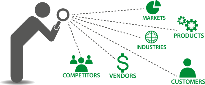
Competitive and Comparative Analysis
Analysis of 3 services that are either direct or indirect competitors.
Literature Review
Referenced Nielson Norman Group studies and articles to ensure best practices.
IDEATION AND ITERATION
Identifying friction points and issues that conflict with the established principles, I began quick screen by screen audits. I consolidated the best ideas based off of heuristic evaluations and proposed the solutions.
2 Flows for Options: I worked towards creating two options for flow recommendations in order to offer choice and perspective for their team to consider.


SOLUTION
I created two flow options with detailed, page by page UX recommendations. The result included simplified processes, reduced redundancy and clarified user objectives; a clearer, more efficient way for users to move through the flow.
ANNOTATED PAGES
Landing Page
Flight Form Page